PagerLayout
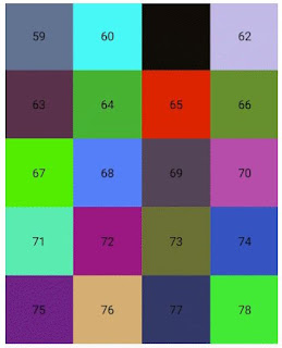
A PagerGridLayoutManager combine PageView and GridLayoutManager.- replace "viewPager>recyclerView" with just only a "RecyclerView"
- reduce memory using by cache all items
- grid layout support
- custom indicator drawable support
- add lock, dot and corner for each item
Install
implementation 'com.github.qicodes:lockitem:1.0.0'
implementation 'com.github.qicodes:pagerlayout:1.0.0'
How To Use
add PagerLayoutManager as recyclerView's layoutManager
recyclerView.layoutManager = PagerLayoutManager()
set a adapter to recyclerView as usual
recyclerView.adapter = SlideAdapter(baseContext)
set PagerSnapHelper to scroll like a PageView
PagerSnapHelper().attachToRecyclerView(recyclerView)
That's all!
We will layout all children automatically using pager grid.
if you want a indicator , we supply 4 kind indicators as implements of PageIndicator. Dot, Line, Square, Drawable.
just need a attachToRecyclerView.
dotIndicator.attachToRecyclerView(recyclerView)
lineIndicator.attachToRecyclerView(recyclerView)
lineIndicator2.attachToRecyclerView(recyclerView)
drawIndicator.attachToRecyclerView(recyclerView)
if you need your item in RecyclerView with lock or dot, you can implementation lockitem,and control the value with xml define in Demo or java/kotlin code Demo
just like GridLayoutManager you can set the grid weights of each item
The default spanCount is 12, you can using this to layout children by all (1,2,3,4,6,12). Also you can custom this spanCount.
Here is a simple example with kotlin code:
recyclerView.layoutManager = PagerLayoutManager(12) {
when (it) {
37 -> SlideAdapter.TYPE_1
in 0..1 -> SlideAdapter.TYPE_2
in 18..20 -> SlideAdapter.TYPE_3
in 46..51 -> SlideAdapter.TYPE_6
in 56..58 -> SlideAdapter.TYPE_3
else -> SlideAdapter.TYPE_4
}
}
Cache Item By Type
Control to cache item just like RecyclerView for each type of item.
recyclerView.recycledViewPool.setMaxRecycledViews(SlideAdapter.TYPE_6, 20)
recyclerView.recycledViewPool.setMaxRecycledViews(SlideAdapter.TYPE_4, 20)
recyclerView.recycledViewPool.setMaxRecycledViews(SlideAdapter.TYPE_3, 4)
recyclerView.recycledViewPool.setMaxRecycledViews(SlideAdapter.TYPE_2, 4)
recyclerView.recycledViewPool.setMaxRecycledViews(SlideAdapter.TYPE_1, 4)
Indicator
You can set width, height, normalColor, selectColor, padding, round to indicator.
Also you can set a Bitmap as indicator
android:padding="8dp"
app:indicatorHeight="26dp"
app:indicatorWidth="26dp"
app:normalColor="@android:color/holo_blue_light"
app:selectColor="@android:color/holo_orange_light"
app:round="true"
XML
For detail config, here is a Demo for you.
Lock && Dot
Each item can be covered with lock and dot, and the number in dot, here is a Demo
lockItem.showNumber = false
lockItem.dotNumber = -1
lockItem.showLock = false
Also, you can control this with xml:
<com.abelhu.lockitem.LockItem
android:id="@+id/iconView"
android:layout_width="0dp"
android:layout_height="0dp"
android:padding="8dp"
android:src="@color/colorAccent"
app:cornerSize="8dp"
app:dotBackgroundColor="@android:color/white"
app:dotBackgroundRadio="0.5dp"
app:dotBigRadio="8dp"
app:dotNormalRadio="4dp"
app:dotNumber="88"
app:dotTextSize="12sp"
app:layout_constraintDimensionRatio="w, 1:1"
app:layout_constraintEnd_toEndOf="parent"
app:layout_constraintStart_toStartOf="parent"
app:layout_constraintTop_toTopOf="parent"
app:lock="@mipmap/icon_lock"
app:lockBackgroundColor="#aa000000"
app:lockHeight="23.5dp"
app:lockText="@string/app_name"
app:lockTextColor="@android:color/white"
app:lockTextMargin="8dp"
app:lockTextSize="12sp"
app:lockWidth="21dp"
app:showLock="true"
app:showNumber="true"
app:srcCompat="@drawable/ic_launcher_foreground"
tools:ignore="ContentDescription" />


No comments:
Post a Comment